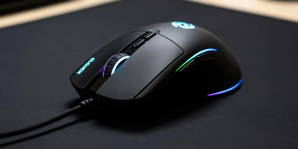
Take a look at the mouse on your desk. It’s probably a sleek, sculpted piece of plastic, maybe with a glowing logo and a satisfyingly smooth scroll wheel. It looks great. But in the world of design, looks can be deceiving. In our relentless march toward minimalism, we’ve stripped away one of the most useful, efficient, and downright brilliant pieces of user interface design ever created: the dedicated third mouse button. We traded a titan of productivity for a slightly cleaner aesthetic, and it’s time we admitted our mistake.
The Magic of the Middle Click
For anyone who spends their day in a web browser, the middle button is not a luxury; it’s a necessity. Its primary function was a stroke of genius: hover over a link, press the middle button, and boom—the link opens in a new background tab. No awkward finger gymnastics holding down the ‘Ctrl’ key. No clumsy right-click-and-navigate-a-menu dance. It was a single, fluid action that let you collect a series of links to read later without ever leaving your current page. It’s a workflow so perfect and simple that its absence in modern design is baffling.
A Power User’s Best Friend
The middle button’s usefulness went far beyond browsing. In the world of creative and technical software, it was a workhorse. In 3D modeling and CAD programs, the middle button is often used to pan or orbit the view, a fundamental action you perform thousands of times a day. In many video games, it served as a quick-access button for a special weapon or ability. It was a universal “extra” input that developers could assign to a critical function, and power users relied on it to work faster and smarter.
The Tyranny of ‘Simplicity’
So, where did it go? We can largely thank the cult of minimalism that prizes form over function. The idea that “simpler is better” led designers to shave off anything deemed non-essential. The scroll wheel, while a fantastic invention in its own right, began to absorb the middle button’s job. But clicking a stiff, clunky scroll wheel is not the same as pressing a dedicated, tactile button. We were told this was a more elegant solution, but in reality, it was a downgrade disguised as progress.
Living with Awkward Workarounds
Without a dedicated third button, we’re left with a collection of inefficient workarounds. The ‘Ctrl+Click’ method requires two hands or an awkward claw-like grip on the mouse. The right-click menu adds an extra step and breaks your focus. Some people don’t even know the scroll wheel can be clicked, and those who do often find it uncomfortable and imprecise. We have accepted a slower, clunkier way of interacting with our computers because the hardware companies decided we didn’t need that extra bit of function.
A Simple Plea for a Better Click
This isn’t just about nostalgia for old, beige hardware. It’s about reclaiming a piece of design that fundamentally respects the user’s time and effort. The dedicated middle mouse button is a prime example of a tool that does its job perfectly. Bringing it back doesn’t mean we need to abandon modern aesthetics or technology. It simply means we should demand tools that are built for doing, not just for looking good on a desk. It’s time to bring back the third button and make our mice mighty once more.


